React Native Docs
React Native 공식 문서 정리
Basic: Core Components and Native Components
React Native는 React와 각 플랫폼의 네이티브 기능을 활용해 Android와 iOS 애플리케이션을 개발할 수 있는 오픈 소스 프레임워크이다. 먼저 React Native가 어떻게 동작하는지 알아보겠습니다.
Views and mobile development
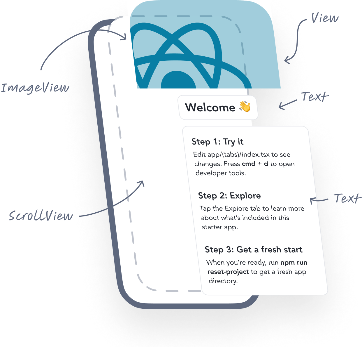
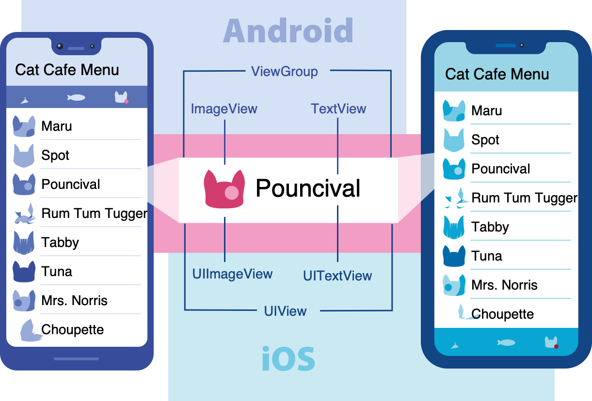
Android와 iOS 개발에서 view 는 UI의 기본 빌딩 블록이다. 텍스트, 이미지, 사용자 입력, 라인, 버튼 등을 나타내는데 사용된다.
Native Components
런타임시, React Native는 해당 컴포넌트에 대응되는 Android 및 iOS 뷰를 생성한다. React Native 컴포넌트는 Android와 iOS의 동일한 뷰를 기반으로 하기 때문에, React Native 앱은 다른 앱과 동일한 외형, 성능을 가진다. 이러한 플랫폼 기반 컴포넌트를 ‘Native Components’ 라고 부른다.
React Native는 앱 개발을 바로 시작할 수 있도록 필수적이고 즉시 사용할 수 있는 네이티브 컴포넌트들을 기본으로 제공한다. 이를 React Native의 Core Components 라고 한다.
Core Components
React Native에는 다양한 기능을 위한 Core Component들이 많이 있다. 대부분 다음과 같은 핵심 컴포넌트를 주로 사용하게 된다.
| React Native UI Component | Android View | iOS View | Web Analog | Description |
|---|---|---|---|---|
<View> | <ViewGroup> | <UIView> | non-scrolling <div> | flexbox, style, touch handling, accessibility controls를 지원한다. |
<Text> | <TextView> | <UITextView> | <p> | 문자열을 표시하고 스타일을 적용하며 중첩할 수 있고, 터치 이벤트를 처리할 수 있다. |
<Image> | <ImageView> | <UIImageView> | <img> | 다양한 종류의 이미지를 표시한다. |
<ScrollView> | <ScrollView> | <UIScrollView> | <div> | 여러 컴포넌트와 뷰를 포함할 수 있는 범용 스크롤 컨테이너 |
<TextInput> | <EditText> | <UITextField> | <input type="text"> | 사용자 입력 |
다음과 같이 여러 Core Component를 사용하는 방법에 대해서 살펴볼 예정이다.
1
2
3
4
5
6
7
8
9
10
11
12
13
14
15
16
17
18
19
20
21
22
23
24
25
26
27
28
29
import React from 'react';
import {View, Text, Image, ScrollView, TextInput} from 'react-native';

const App = () => {
  return (
    <ScrollView>
      <Text>Some text</Text>
      <View>
        <Text>Some more text</Text>
        <Image
          source={{
            uri: 'https://reactnative.dev/docs/assets/p_cat2.png',
          }}
          style={{width: 200, height: 200}}
        />
      </View>
      <TextInput
        style={{
          height: 40,
          borderColor: 'gray',
          borderWidth: 1,
        }}
        defaultValue="You can type in me"
      />
    </ScrollView>
  );
};

export default App;
Basic: React Fundamentals
React Native는 React 위에서 실행된다. React는 JavaScript로 UI를 만들기 위한 오픈 소스 라이브러리이다. React Native를 잘 활용하려면 React 자체를 이해하는 것이 도움이 된다. 다음으로 React의 핵심 개념에 대해 살펴보자.
React의 핵심 개념은 다음과 같다.
- components
- JSX
- props
- state
Your first component
1
2
3
4
5
6
7
import {Text} from "react-native";

export default function ReactFundamentals() {
  return (
    <Text>Hello, I am your cat!</Text>
  )
}
- React Native의
Text코어 컴포넌트를import하여ReactFundamentals컴포넌트를 만들었다. - 이와 같은 함수형 컴포넌트가 반환하는 값은 React 엘리먼트로 렌더링된다.
export default문법을 사용하여 앱 전역에서 사용할 수 있도록 내보낸다.
JSX
React와 React Native는 JSX를 사용한다. JSX는 <Text>Hello, I am your cat!</Text> 와 같이 자바스크립트 안에 엘리먼트를 작설할 수 있는 문법이다. 그러므로 다음과 같이 JSX에 변수를 넣을 수 있다.
1
2
3
4
5
6
7
8
import {Text} from "react-native";

export default function ReactFundamentals() {
  const name = "Maru";
  return (
    <Text>Hello, I am {name}!</Text>
  )
}
다음과 같이 중괄호 안에서 표현식도 사용할 수 있다.
1
2
3
4
5
6
7
8
9
10
11
12
13
14
15
import {Text, View} from "react-native";

export default function ReactFundamentals() {
  const name = "Maru";
  return (
    <View>
      <Text>Hello, I am {name}!</Text>
      <Text>Hello, I am {getFullName("Sangmin", "lee")}!</Text>
    </View>
    )
}

const getFullName = (firstName: string, lastName: string) => {
  return `${firstName} ${lastName}`;
}
Custom Components
React에서는 컴포넌트를 서로 중첩하여 새로운 컴포넌트를 만들 수 있다. 이렇게 중첩 가능하고 재사용 가능한 컴포넌트는 React 패러다임의 핵심이다.
다음과 같이 View 컴포넌트 아래에 Text 와 TextInput 컴포넌트를 중첩할 수 있다.
1
2
3
4
5
6
7
8
9
10
11
12
13
14
15
16
17
18
19
20
import React from 'react';
import {Text, TextInput, View} from 'react-native';

const Cat = () => {
  return (
    <View>
      <Text>Hello, I am...</Text>
      <TextInput
        style={{
          height: 40,
          borderColor: 'gray',
          borderWidth: 1,
        }}
        defaultValue="Name me!"
      />
    </View>
  );
};

export default Cat;
다음과 같이 컴포넌트를 여러 번 사용할 수도 있다.
1
2
3
4
5
6
7
8
9
10
11
12
13
14
15
16
17
18
19
20
21
22
23
import React from 'react';
import {Text, View} from 'react-native';

const Cat = () => {
  return (
    <View>
      <Text>I am also a cat!</Text>
    </View>
  );
};

const Cafe = () => {
  return (
    <View>
      <Text>Welcome!</Text>
      <Cat />
      <Cat />
      <Cat />
    </View>
  );
};

export default Cafe;
Cafe컴포넌트는 각Cat자식 컴포넌트들의 부모 컴포넌트가 된다.
Props
Props는 “properties”의 줄임말이며, React 컴포넌트를 커스텀할 수 있게 해준다.
1
2
3
4
5
6
7
8
9
10
11
12
13
14
15
16
17
18
19
20
21
22
23
24
25
26
import React from 'react';
import {Text, View} from 'react-native';

type CatProps = {
  name: string;
};

const Cat = (props: CatProps) => {
  return (
    <View>
      <Text>Hello, I am {props.name}!</Text>
    </View>
  );
};

const Cafe = () => {
  return (
    <View>
      <Cat name="Maru" />
      <Cat name="Jellylorum" />
      <Cat name="Spot" />
    </View>
  );
};

export default Cafe;
React Native의 대부분의 코어 컴포넌트는 props로 커스텀 할 수 있다. 예를 들어 Image 는 source prop을 전달하여 이미지를 정의할 수 있다.
1
2
3
4
5
6
7
8
9
10
11
12
13
14
15
16
17
18
import React from 'react';
import {Text, View, Image} from 'react-native';

const CatApp = () => {
  return (
    <View>
      <Image
        source={{
          uri: 'https://reactnative.dev/docs/assets/p_cat1.png',
        }}
        style={{width: 200, height: 200}}
      />
      <Text>Hello, I am your cat!</Text>
    </View>
  );
};

export default CatApp;
JSX에서는 JavaScript 값을
{}로 참조한다. 배열이나 숫자처럼 문자열이 아닌 값을 props로 전달할 때 유용하다(<Cat food={["fish","kibble"]} age={2} />). 하지만 JavaScript 객체는 자체적으로 중괄호{}로 정의되므로, JSX에서 객체를 전달할 때는 그것을 중괄호로 한 번 더 감싸야 한다.
State
props가 컴포넌트의 렌더링 방식을 설정하는 “인자(argument)”라면, state는 컴포넌트의 “개인적인 데이터 저장소” 라고 볼 수 있다. state는 시간이 지나며 변화하거나 사용자 상호작용에 따라 바뀌는 데이터를 다룰 때 유용하다.
컴포넌트에 상태를 추가하려면 React의 useState 훅을 호출하면 된다. 훅은 React의 기능에 “접근(hook into)” 할 수 있게 해주는 특수한 함수이다. 다시 말해 useState 는 함수형 컴포넌트에 상태를 추가할 수 있도록 해주는 훅이다.
1
2
3
4
5
6
7
8
9
10
11
12
13
14
15
16
17
18
19
20
21
22
23
24
25
26
27
28
29
30
31
32
33
34
35
36
import React, {useState} from 'react';
import {Button, Text, View} from 'react-native';

type CatProps = {
  name: string;
};

const Cat = (props: CatProps) => {
  const [isHungry, setIsHungry] = useState(true);

  return (
    <View>
      <Text>
        I am {props.name}, and I am {isHungry ? 'hungry' : 'full'}!
      </Text>
      <Button
        onPress={() => {
          setIsHungry(false);
        }}
        disabled={!isHungry}
        title={isHungry ? 'Give me some food, please!' : 'Thank you!'}
      />
    </View>
  );
};

const Cafe = () => {
  return (
    <>
      <Cat name="Munkustrap" />
      <Cat name="Spot" />
    </>
  );
};

export default Cafe;
- React로부터
useState를 import 한다. useState로isHungry상태를 생성한다.useState를 호출하면 두 가지가 일어난다.- 초기값과 함께 상태 변수를 생성한다.
- 그 상태 변수의 값을 변경할 수 있는 함수도 함께 생성한다.
Basic: Handling Text Input
TextInput 은 사용자가 텍스트를 입력할 수 있게 하는 코어 컴포넌트이다. 텍스트가 변경될 때마다 호출될 함수를 받는 onChangeText prop 과 텍스트 입력이 완료되었을 때 호출될 함수를 받는 onSubmitEditing prop을 갖는다.
1
2
3
4
5
6
7
8
9
10
11
12
13
14
15
16
17
18
19
20
21
22
23
24
import React, {useState} from 'react';
import {Text, TextInput, View} from 'react-native';

const PizzaTranslator = () => {
  const [text, setText] = useState('');
  return (
    <View style={{padding: 10}}>
      <TextInput
        style={{height: 40, padding: 5}}
        placeholder="Type here to translate!"
        onChangeText={newText => setText(newText)}
        defaultValue={text}
      />
      <Text style={{padding: 10, fontSize: 42}}>
        {text
          .split(' ')
          .map(word => word && '🍕')
          .join(' ')}
      </Text>
    </View>
  );
};

export default PizzaTranslator;
Basic: Using a ScrollView
ScrollView는 여러 컴포넌트와 뷰를 포함할 수 있는 범용 스크롤 컨테이너이다. 스크롤 가능한 항목들은 서로 다른 형태일 수 있으며, horizontal 속성을 설정하면 세로뿐만 아니라 가로로도 스크롤할 수 있다.
1
2
3
4
5
6
7
8
9
10
11
12
13
14
15
16
17
18
19
20
21
22
23
24
25
26
27
28
29
30
31
32
33
34
35
36
37
38
39
40
41
42
43
44
45
46
import React from 'react';
import {Image, ScrollView, Text} from 'react-native';

const logo = {
  uri: 'https://reactnative.dev/img/tiny_logo.png',
  width: 64,
  height: 64,
};

const App = () => (
  <ScrollView>
    <Text style={{fontSize: 96}}>Scroll me plz</Text>
    <Image source={logo} />
    <Image source={logo} />
    <Image source={logo} />
    <Image source={logo} />
    <Image source={logo} />
    <Text style={{fontSize: 96}}>If you like</Text>
    <Image source={logo} />
    <Image source={logo} />
    <Image source={logo} />
    <Image source={logo} />
    <Image source={logo} />
    <Text style={{fontSize: 96}}>Scrolling down</Text>
    <Image source={logo} />
    <Image source={logo} />
    <Image source={logo} />
    <Image source={logo} />
    <Image source={logo} />
    <Text style={{fontSize: 96}}>What's the best</Text>
    <Image source={logo} />
    <Image source={logo} />
    <Image source={logo} />
    <Image source={logo} />
    <Image source={logo} />
    <Text style={{fontSize: 96}}>Framework around?</Text>
    <Image source={logo} />
    <Image source={logo} />
    <Image source={logo} />
    <Image source={logo} />
    <Image source={logo} />
    <Text style={{fontSize: 80}}>React Native</Text>
  </ScrollView>
);

export default App;
ScrollView는 pagingEnabled props를 사용하여 스와이프 제스처로 뷰를 페이지 단위로 넘기도록 설정할 수 있다.
ScrollView는 크기가 제한된 항목을 표시할 때 가장 적합하다. 화면에 보이지 않더라도 ScrollView에 포함된 모든 요소와 뷰는 한 번에 렌더링된다. 따라서 화면에 다 담기지 않는 긴 목록을 표시해야 할 경우에는 FlatList 를 사용하는 것이 좋다.
Basic: Using List Views
React Native는 데이터 목록을 보여주는 다양한 컴포넌트를 제공한다. 일반적으로 FlatList 나 SectionList 중 하나를 사용한다.
FlatList 컴포넌트는 변화하지만 구조가 유사한 데이터를 스크롤 가능한 리스트 형태로 보여준다. FlatList 는 항목 수가 시간이 지나면 바뀔 수 있는 긴 데이터 리스트에 적합하다. ScrollView 와 달리, FlatList 는 화면에 현재 표시되는 항목만 렌더링하여 전체 항목을 한꺼번에 렌더링하지 않는다.
FlatList 컴포넌트를 사용하려면 data 와 renderItem 두 props가 필수이다. data 는 리스트의 데이터 원본이며, renderItem 은 데이터 원본에서 하나의 아이템을 받아 화면에 렌더링할 형식의 컴포넌트를 반환하는 함수이다.
1
2
3
4
5
6
7
8
9
10
11
12
13
14
15
16
17
18
19
20
21
22
23
24
25
26
27
28
29
30
31
32
33
34
35
36
37
38
import React from 'react';
import {FlatList, StyleSheet, Text, View} from 'react-native';

const styles = StyleSheet.create({
  container: {
    flex: 1,
    paddingTop: 22,
  },
  item: {
    padding: 10,
    fontSize: 18,
    height: 44,
  },
});

const FlatListBasics = () => {
  return (
    <View style={styles.container}>
      <FlatList
        data={[
          {key: 'Devin'},
          {key: 'Dan'},
          {key: 'Dominic'},
          {key: 'Jackson'},
          {key: 'James'},
          {key: 'Joel'},
          {key: 'John'},
          {key: 'Jillian'},
          {key: 'Jimmy'},
          {key: 'Julie'},
        ]}
        renderItem={({item}) => <Text style={styles.item}>{item.key}</Text>}
      />
    </View>
  );
};

export default FlatListBasics;
데이터를 논리적인 섹션으로 나눠서, 각 섹션에 헤더를 표시하는 방식으로 렌더링하고 싶다면 SectionList 를 사용하는 것이 적절하다.
1
2
3
4
5
6
7
8
9
10
11
12
13
14
15
16
17
18
19
20
21
22
23
24
25
26
27
28
29
30
31
32
33
34
35
36
37
38
39
40
41
42
43
44
45
46
47
48
49
50
51
52
53
54
import React from 'react';
import {SectionList, StyleSheet, Text, View} from 'react-native';

const styles = StyleSheet.create({
  container: {
    flex: 1,
    paddingTop: 22,
  },
  sectionHeader: {
    paddingTop: 2,
    paddingLeft: 10,
    paddingRight: 10,
    paddingBottom: 2,
    fontSize: 14,
    fontWeight: 'bold',
    backgroundColor: 'rgba(247,247,247,1.0)',
  },
  item: {
    padding: 10,
    fontSize: 18,
    height: 44,
  },
});

const SectionListBasics = () => {
  return (
    <View style={styles.container}>
      <SectionList
        sections={[
          {title: 'D', data: ['Devin', 'Dan', 'Dominic']},
          {
            title: 'J',
            data: [
              'Jackson',
              'James',
              'Jillian',
              'Jimmy',
              'Joel',
              'John',
              'Julie',
            ],
          },
        ]}
        renderItem={({item}) => <Text style={styles.item}>{item}</Text>}
        renderSectionHeader={({section}) => (
          <Text style={styles.sectionHeader}>{section.title}</Text>
        )}
        keyExtractor={item => `basicListEntry-${item}`}
      />
    </View>
  );
};

export default SectionListBasics;
Basic: Platform-Specific Code
경우에 따라 플랫폼별로 코드를 다르게 구현하는 것이 적합할 때도 있다. 예를 들어, Android와 iOS에서 각각 다른 UI 컴포넌트를 구현하고 싶을 수 있다.
React Native는 플랫폼별 코드를 분리할 수 있도록 두 가지 방법을 제공한다.
Platform모듈 사용하기- 플랫폼 전용 파일 확장자 사용하기
일부 컴포넌트의 속성은 특정 플랫폼에서만 작동할 수 있으며, 이런 속성들은 공식 문서에서 @platform 주석이 달려 있다.
Platform module
React Native는 어떤 앱에서 실행 중인지 확인할 수 있는 모듈을 제공한다. 이를 활용해서 플랫폼 특화된 코드를 구현할 수 있다.
1
2
3
4
5
6
7
8
9
10
11
12
13
14
import {Platform, Text, View} from "react-native";

export default function PlatformSpecificCode() {
  let platform = Platform.OS === "ios" ? "iOS" : "Android";
  return (
    <View style={{
      flex: 1,
      justifyContent: 'center',
      alignItems: 'center',
    }}>
      <Text>{platform}</Text>
    </View>
    )
}
Platform.IO는ios이거나android가 될 수 있다.
Platform.select 메서드를 사용해 구현할 수도 있다. 이 메서드는 'ios' | 'android' | 'native' | 'default' 중에 하나의 키가 될 수 있는 객체를 전달하면 실행 중인 플랫폼에 맞는 값을 받는다. 모바일 기기에서 실행 중이라면 ios 또는 android 키로 적용되고, 그 둘이 없을 경우 native 키가 사용되며, 그것도 없으면 default 키가 적용된다.
1
2
3
4
5
6
7
8
9
10
11
12
13
14
15
16
17
18
19
20
21
22
23
24
25
26
27
28
29
import {Platform, StyleSheet, Text, View} from "react-native";

export default function PlatformSpecificCode() {
  let platform = Platform.OS === "ios" ? "iOS" : "Android";
  return (
    <View style={styles.container}>
      <Text>{platform}</Text>
    </View>
    )
}

const styles = StyleSheet.create({
  container: {
    flex: 1,
    justifyContent: 'center',
    alignItems: 'center',
    ...Platform.select({
      ios: {
        backgroundColor: 'blue',
      },
      android: {
        backgroundColor: 'green',
      },
      default: {
        backgroundColor: 'red',
      }
    })
  }
})
플랫폼 특화된 컴포넌트를 사용하려면 다음과 같이 사용하면 된다.
1
2
3
4
5
6
const Component = Platform.select({
ios: () => require('ComponentIOS'),
android: () => require('ComponentAndroid'),
})();

<Component />;
Detecting the Android version
1
2
3
4
5
import {Platform} from 'react-native';

if (Platform.Version === 25) {
  console.log('Running on Nougat!');
}
Detecting the iOS version
1
2
3
4
5
6
import {Platform} from 'react-native';

const majorVersionIOS = parseInt(Platform.Version, 10);
if (majorVersionIOS <= 9) {
  console.log('Work around a change in behavior');
}
Platform-specific extensions
플랫폼별 코드가 복잡하다면 코드를 여러 파일로 나누는 것이 좋다. React Native는 파일 이름에 .ios 나 .android 확장자가 포함되어 있으면 자동으로 이를 감지하여, 다른 컴포넌트에서 해당 플랫폼에 맞는 파일을 불러온다.
UI: Style
모든 코어 컴포넌트는 style prop을 받는다. style 이름과 값은 웹의 CSS 방식과 유사하다. 단, 이름은 background-color 대신 backgroundColor 처럼 카멜 케이스로 작성해야 한다.
style prop은 일반적인 JavaScript 객체 형태로 지정할 수 있다. 또한 스타일 배열을 전달할 수 있으며, 배열의 마지막에 있는 스타일이 우선 적용되므로 이를 활용해 스타일을 상속하거나 덮어쓸 수 있다.
컴포넌트가 점점 복잡해질수록 여러 스타일을 한 곳에서 정의하기 위해 StyleSheet.create 를 사용하는 것이 더 깔끔한 방법이다. 다음은 그 예시이다.
1
2
3
4
5
6
7
8
9
10
11
12
13
14
15
16
17
18
19
20
21
22
23
24
25
26
27
28
29
import React from 'react';
import {StyleSheet, Text, View} from 'react-native';

const LotsOfStyles = () => {
  return (
    <View style={styles.container}>
      <Text style={styles.red}>just red</Text>
      <Text style={styles.bigBlue}>just bigBlue</Text>
      <Text style={[styles.bigBlue, styles.red]}>bigBlue, then red</Text>
      <Text style={[styles.red, styles.bigBlue]}>red, then bigBlue</Text>
    </View>
  );
};

const styles = StyleSheet.create({
  container: {
    marginTop: 50,
  },
  bigBlue: {
    color: 'blue',
    fontWeight: 'bold',
    fontSize: 30,
  },
  red: {
    color: 'red',
  },
});

export default LotsOfStyles;
자주 사용하는 패턴 중 하나는, 컴포넌트가 style prop을 받아 내부의 서브 컴포넌트에 스타일을 전달하는 방식이다. 이 방식을 활용하면 CSS에서처럼 스타일이 “계단식으로(cascade)” 적용되도록 만들 수 있다.
UI: Height and Width
컴포넌트의 height과 width는 화면에서의 크기를 결정한다.
Fixed Dimensions
컴포넌트의 크기를 설정하는 일반적인 방법은 style 에 고정된 width 와 height 값을 지정하는 것이다. React Native에서의 모든 크기 단위는 단위가 없으며, 이는 density independent pixels를 의미한다.
1
2
3
4
5
6
7
8
9
10
11
12
13
14
15
16
17
18
19
20
21
22
23
24
25
26
27
28
29
30
31
32
import React from 'react';
import {View} from 'react-native';

const FixedDimensionsBasics = () => {
  return (
    <View>
      <View
        style={{
          width: 50,
          height: 50,
          backgroundColor: 'powderblue',
        }}
      />
      <View
        style={{
          width: 100,
          height: 100,
          backgroundColor: 'skyblue',
        }}
      />
      <View
        style={{
          width: 150,
          height: 150,
          backgroundColor: 'steelblue',
        }}
      />
    </View>
  );
};

export default FixedDimensionsBasics;
- 컴포넌트의 크기가 화면 크기에 따라 계산되지 않고 항상 일정한 값으로 고정되어야 할 때 사용된다.
Flex Dimensions
flex 를 스타일에 사용하면, 컴포넌트가 사용 가능한 공간을 기준으로 자동으로 확장하거나 축소되도록 만들 수 있다. 일반적으로 flex: 1 을 사용하며, 이는 해당 컴포넌트가 부모 안에서 가능한 모든 공간을 차지하되, 형제 컴포넌트들과 균등하게 나누도록 한다. flex 값이 클수록 형제 컴포넌트에 비해 더 많은 공간을 차지하게 된다.
1
2
3
4
5
6
7
8
9
10
11
12
13
14
import React from 'react';
import {View} from 'react-native';

const FlexDimensionsBasics = () => {
  return (
    <View style={{flex: 1}}>
      <View style={{flex: 1, backgroundColor: 'powderblue'}} />
      <View style={{flex: 2, backgroundColor: 'skyblue'}} />
      <View style={{flex: 3, backgroundColor: 'steelblue'}} />
    </View>
  );
};

export default FlexDimensionsBasics;
Percentage Dimensions
화면의 특정 비율을 채우고 싶지만 flex 레이아웃을 사용하고 싶지 않은 경우, 스타일에 퍼센트 값을 사용할 수 있다. flex 와 마찬가지로 퍼센트 단위의 크기를 사용하려면 부모 컴포넌트에 명확한 크기가 정의되어 있어야 한다.
1
2
3
4
5
6
7
8
9
10
11
12
13
14
15
16
17
18
19
20
21
22
23
24
25
26
27
28
29
30
31
32
33
import React from 'react';
import {View} from 'react-native';

const PercentageDimensionsBasics = () => {
  // Try removing the `height: '100%'` on the parent View.
  // The parent will not have dimensions, so the children can't expand.
  return (
    <View style={{height: '100%'}}>
      <View
        style={{
          height: '15%',
          backgroundColor: 'powderblue',
        }}
      />
      <View
        style={{
          width: '66%',
          height: '35%',
          backgroundColor: 'skyblue',
        }}
      />
      <View
        style={{
          width: '33%',
          height: '50%',
          backgroundColor: 'steelblue',
        }}
      />
    </View>
  );
};

export default PercentageDimensionsBasics;
UI: Layout with Flexbox
컴포넌트는 자식 요소들의 레이아웃을 Flexbox 알고리즘을 사용하여 지정할 수 있다. Flexbox는 다양한 화면 크기에서도 일관된 레이아웃을 제공하도록 설계되었다.
Flexbox는 React Native에서 웹의 CSS와 거의 동일하게 동작하지만, 몇 가지 기본값에서 차이가 있다.
flexDirection의 기본값은row가 아닌column이다.alignContent의 기본값은stretch가 아닌flex-start이다.flexShrink의 기본값은1이 아닌0이다.flex속성은 단일 숫자만 지원한다.
Flex
flex 는 자식 요소들이 주 축(main axis)을 따라 남은 공간을 어떻게 “채울지”를 정의한다. 각 요소의 flex 값에 따라 공간이 나누어진다.
1
2
3
4
5
6
7
8
9
10
11
12
13
14
15
16
17
18
19
20
21
22
23
24
25
26
27
import React from 'react';
import {StyleSheet, View} from 'react-native';

const Flex = () => {
  return (
    <View
      style={[
        styles.container,
        {
          flexDirection: 'column',
        },
      ]}>
      <View style={{flex: 1, backgroundColor: 'red'}} />
      <View style={{flex: 2, backgroundColor: 'darkorange'}} />
      <View style={{flex: 3, backgroundColor: 'green'}} />
    </View>
  );
};

const styles = StyleSheet.create({
  container: {
    flex: 1,
    padding: 20,
  },
});

export default Flex;
Flex Direction
flexDirection 은 자식 요소들이 어떤 방향으로 배치될지를 제어한다. 이를 주 축(main axis)이라고 부르며, 주 축에 수직인 축은 교차 축(cross axis)이라고 한다. 줄바꿈이 발생할 경우, 교차 축 방향으로 줄이 새로 배치된다.
| 값 | 의미 | 동작 설명 |
|---|---|---|
| column (기본값) | 위 → 아래 | 자식 요소들을 위에서 아래로 정렬합니다. 줄바꿈이 되면 다음 줄은 컨테이너의 위쪽 오른쪽에서 시작합니다. |
| row | 왼쪽 → 오른쪽 | 자식 요소들을 왼쪽에서 오른쪽으로 정렬합니다. 줄바꿈 시 다음 줄은 왼쪽 아래에서 시작됩니다. |
| column-reverse | 아래 → 위 | 자식 요소들을 아래에서 위로 정렬합니다. 줄바꿈 시 다음 줄은 아래쪽 오른쪽에서 시작됩니다. |
| row-reverse | 오른쪽 → 왼쪽 | 자식 요소들을 오른쪽에서 왼쪽으로 정렬합니다. 줄바꿈 시 다음 줄은 오른쪽 아래에서 시작됩니다. |
1
2
3
4
5
6
7
8
9
10
11
12
13
14
15
16
17
18
19
20
21
22
23
24
25
26
27
28
29
30
31
32
33
34
35
36
37
38
39
40
41
42
43
44
45
46
47
48
49
50
51
52
53
54
55
56
57
58
59
60
61
62
63
64
65
66
67
68
69
70
71
72
73
74
75
76
77
78
79
80
81
82
83
84
85
86
87
88
89
90
91
92
93
94
95
96
97
98
99
100
101
import React, {useState} from 'react';
import {StyleSheet, Text, TouchableOpacity, View} from 'react-native';
import type {PropsWithChildren} from 'react';

const FlexDirectionBasics = () => {
  const [flexDirection, setflexDirection] = useState('column');

  return (
    <PreviewLayout
      label="flexDirection"
      values={['column', 'row', 'column-reverse', 'row-reverse']}
      selectedValue={flexDirection}
      setSelectedValue={setflexDirection}>
      <View style={[styles.box, {backgroundColor: 'powderblue'}]} />
      <View style={[styles.box, {backgroundColor: 'skyblue'}]} />
      <View style={[styles.box, {backgroundColor: 'steelblue'}]} />
    </PreviewLayout>
  );
};

type PreviewLayoutProps = PropsWithChildren<{
  label: string;
  values: string[];
  selectedValue: string;
  setSelectedValue: (value: string) => void;
}>;

const PreviewLayout = ({
  label,
  values,
  selectedValue,
  setSelectedValue,
  children,
}: PreviewLayoutProps) => (
  <View style={{padding: 10, flex: 1}}>
    <Text style={styles.label}>{label}</Text>
    <View style={styles.row}>
      {values.map(value => (
        <TouchableOpacity
          key={value}
          onPress={() => setSelectedValue(value)}
          style={[styles.button, selectedValue === value && styles.selected]}>
          <Text
            style={[
              styles.buttonLabel,
              selectedValue === value && styles.selectedLabel,
            ]}>
            {value}
          </Text>
        </TouchableOpacity>
      ))}
    </View>
    <View style={[styles.container, {[label]: selectedValue}]}>{children}</View>
  </View>
);

const styles = StyleSheet.create({
  container: {
    flex: 1,
    marginTop: 8,
    backgroundColor: 'aliceblue',
  },
  box: {
    width: 50,
    height: 50,
  },
  row: {
    flexDirection: 'row',
    flexWrap: 'wrap',
  },
  button: {
    paddingHorizontal: 8,
    paddingVertical: 6,
    borderRadius: 4,
    backgroundColor: 'oldlace',
    alignSelf: 'flex-start',
    marginHorizontal: '1%',
    marginBottom: 6,
    minWidth: '48%',
    textAlign: 'center',
  },
  selected: {
    backgroundColor: 'coral',
    borderWidth: 0,
  },
  buttonLabel: {
    fontSize: 12,
    fontWeight: '500',
    color: 'coral',
  },
  selectedLabel: {
    color: 'white',
  },
  label: {
    textAlign: 'center',
    marginBottom: 10,
    fontSize: 24,
  },
});

export default FlexDirectionBasics;
Layout Direction
레이아웃 direction 은 계층 구조에서 자식 요소와 텍스트가 어떤 방향으로 배치될지를 지정한다. 또한 start 와 end 가 어떤 방향을 의미하는지도 이 설정에 따라 달라진다.
LTR(default value) : 텍스트와 자식 요소들이 왼쪽에서 오른쪽으로 배치된다.RTL: 텍스트와 자식 요소들이 오른쪽에서 왼쪽으로 배치된다.
1
2
3
4
5
6
7
8
9
10
11
12
13
14
15
16
17
18
19
20
21
22
23
24
25
26
27
28
29
30
31
32
33
34
35
36
37
38
39
40
41
42
43
44
45
46
47
48
49
50
51
52
53
54
55
56
57
58
59
60
61
62
63
64
65
66
67
68
69
70
71
72
73
74
75
76
77
78
79
80
81
82
83
84
85
86
87
88
89
90
91
92
93
94
95
96
97
98
99
100
101
import React, {useState} from 'react';
import {View, TouchableOpacity, Text, StyleSheet} from 'react-native';
import type {PropsWithChildren} from 'react';

const DirectionLayout = () => {
  const [direction, setDirection] = useState('ltr');

  return (
    <PreviewLayout
      label="direction"
      selectedValue={direction}
      values={['ltr', 'rtl']}
      setSelectedValue={setDirection}>
      <View style={[styles.box, {backgroundColor: 'powderblue'}]} />
      <View style={[styles.box, {backgroundColor: 'skyblue'}]} />
      <View style={[styles.box, {backgroundColor: 'steelblue'}]} />
    </PreviewLayout>
  );
};

type PreviewLayoutProps = PropsWithChildren<{
  label: string;
  values: string[];
  selectedValue: string;
  setSelectedValue: (value: string) => void;
}>;

const PreviewLayout = ({
  label,
  children,
  values,
  selectedValue,
  setSelectedValue,
}: PreviewLayoutProps) => (
  <View style={{padding: 10, flex: 1}}>
    <Text style={styles.label}>{label}</Text>
    <View style={styles.row}>
      {values.map(value => (
        <TouchableOpacity
          key={value}
          onPress={() => setSelectedValue(value)}
          style={[styles.button, selectedValue === value && styles.selected]}>
          <Text
            style={[
              styles.buttonLabel,
              selectedValue === value && styles.selectedLabel,
            ]}>
            {value}
          </Text>
        </TouchableOpacity>
      ))}
    </View>
    <View style={[styles.container, {[label]: selectedValue}]}>{children}</View>
  </View>
);

const styles = StyleSheet.create({
  container: {
    flex: 1,
    marginTop: 8,
    backgroundColor: 'aliceblue',
  },
  box: {
    width: 50,
    height: 50,
  },
  row: {
    flexDirection: 'row',
    flexWrap: 'wrap',
  },
  button: {
    paddingHorizontal: 8,
    paddingVertical: 6,
    borderRadius: 4,
    backgroundColor: 'oldlace',
    alignSelf: 'flex-start',
    marginHorizontal: '1%',
    marginBottom: 6,
    minWidth: '48%',
    textAlign: 'center',
  },
  selected: {
    backgroundColor: 'coral',
    borderWidth: 0,
  },
  buttonLabel: {
    fontSize: 12,
    fontWeight: '500',
    color: 'coral',
  },
  selectedLabel: {
    color: 'white',
  },
  label: {
    textAlign: 'center',
    marginBottom: 10,
    fontSize: 24,
  },
});

export default DirectionLayout;
Justify Content
justifyContent 는 컨테이너의 주 축(main axis)을 따라 자식 요소들을 어떻게 정렬할지를 지정한다. 예를 들어, flexDirection이 row 인 경우에는 수평 정렬, column 인 경우에는 수직 정렬에 사용된다. 이 속성을 사용하면 자식 요소를 중앙에 정렬하거나, 간격을 동일하게 나눌 수 있다.
| 값 | 동작 | 설명 |
|---|---|---|
| flex-start (기본값) | 시작 정렬 | 자식들을 주 축의 시작 지점에 붙여 정렬 |
| flex-end | 끝 정렬 | 자식들을 주 축의 끝 지점에 정렬 |
| center | 중앙 정렬 | 자식들을 주 축의 가운데에 정렬 |
| space-between | 양쪽 끝 + 간격 균등 | 첫 요소는 시작, 마지막 요소는 끝에 정렬, 남은 공간은 요소 사이에 균등 배분 |
| space-around | 바깥도 포함해 간격 균등 | 자식들 주변에 동일한 간격 배치. 양 끝 요소 바깥쪽에도 공간이 포함됨 |
| space-evenly | 완전 균등 간격 | 요소 간, 시작과 첫 요소 사이, 끝과 마지막 요소 사이 모두 같은 간격 |
1
2
3
4
5
6
7
8
9
10
11
12
13
14
15
16
17
18
19
20
21
22
23
24
25
26
27
28
29
30
31
32
33
34
35
36
37
38
39
40
41
42
43
44
45
46
47
48
49
50
51
52
53
54
55
56
57
58
59
60
61
62
63
64
65
66
67
68
69
70
71
72
73
74
75
76
77
78
79
80
81
82
83
84
85
86
87
88
89
90
91
92
93
94
95
96
97
98
99
100
101
102
103
104
105
106
107
108
import React, {useState} from 'react';
import {View, TouchableOpacity, Text, StyleSheet} from 'react-native';
import type {PropsWithChildren} from 'react';

const JustifyContentBasics = () => {
  const [justifyContent, setJustifyContent] = useState('flex-start');

  return (
    <PreviewLayout
      label="justifyContent"
      selectedValue={justifyContent}
      values={[
        'flex-start',
        'flex-end',
        'center',
        'space-between',
        'space-around',
        'space-evenly',
      ]}
      setSelectedValue={setJustifyContent}>
      <View style={[styles.box, {backgroundColor: 'powderblue'}]} />
      <View style={[styles.box, {backgroundColor: 'skyblue'}]} />
      <View style={[styles.box, {backgroundColor: 'steelblue'}]} />
    </PreviewLayout>
  );
};

type PreviewLayoutProps = PropsWithChildren<{
  label: string;
  values: string[];
  selectedValue: string;
  setSelectedValue: (value: string) => void;
}>;

const PreviewLayout = ({
  label,
  children,
  values,
  selectedValue,
  setSelectedValue,
}: PreviewLayoutProps) => (
  <View style={{padding: 10, flex: 1}}>
    <Text style={styles.label}>{label}</Text>
    <View style={styles.row}>
      {values.map(value => (
        <TouchableOpacity
          key={value}
          onPress={() => setSelectedValue(value)}
          style={[styles.button, selectedValue === value && styles.selected]}>
          <Text
            style={[
              styles.buttonLabel,
              selectedValue === value && styles.selectedLabel,
            ]}>
            {value}
          </Text>
        </TouchableOpacity>
      ))}
    </View>
    <View style={[styles.container, {[label]: selectedValue}]}>{children}</View>
  </View>
);

const styles = StyleSheet.create({
  container: {
    flex: 1,
    marginTop: 8,
    backgroundColor: 'aliceblue',
  },
  box: {
    width: 50,
    height: 50,
  },
  row: {
    flexDirection: 'row',
    flexWrap: 'wrap',
  },
  button: {
    paddingHorizontal: 8,
    paddingVertical: 6,
    borderRadius: 4,
    backgroundColor: 'oldlace',
    alignSelf: 'flex-start',
    marginHorizontal: '1%',
    marginBottom: 6,
    minWidth: '48%',
    textAlign: 'center',
  },
  selected: {
    backgroundColor: 'coral',
    borderWidth: 0,
  },
  buttonLabel: {
    fontSize: 12,
    fontWeight: '500',
    color: 'coral',
  },
  selectedLabel: {
    color: 'white',
  },
  label: {
    textAlign: 'center',
    marginBottom: 10,
    fontSize: 24,
  },
});

export default JustifyContentBasics;
Align Items
alignItems 는 자식 요소들을 교차 축(cross axis)을 따라 어떻게 정할지를 정의한다. justifyContent 가 주 축(main axis)에 대해 적용되는 반면, alignItems 는 교차 축에 대해 적용된다.
| 값 | 동작 | 설명 |
|---|---|---|
| stretch (기본값) | 늘리기 | 자식 요소들을 교차 축 방향으로 컨테이너의 크기에 맞게 늘림 (단, 자식 요소에 고정된 크기가 없을 경우에만) |
| flex-start | 시작 정렬 | 자식 요소들을 교차 축의 시작 지점에 정렬 |
| flex-end | 끝 정렬 | 자식 요소들을 교차 축의 끝 지점에 정렬 |
| center | 중앙 정렬 | 자식 요소들을 교차 축의 가운데에 정렬 |
| baseline | 기준선 정렬 | 자식 요소들을 공통 기준선(baseline)에 정렬. 자식 요소 중 하나를 기준선으로 지정 가능 |
1
2
3
4
5
6
7
8
9
10
11
12
13
14
15
16
17
18
19
20
21
22
23
24
25
26
27
28
29
30
31
32
33
34
35
36
37
38
39
40
41
42
43
44
45
46
47
48
49
50
51
52
53
54
55
56
57
58
59
60
61
62
63
64
65
66
67
68
69
70
71
72
73
74
75
76
77
78
79
80
81
82
83
84
85
86
87
88
89
90
91
92
93
94
95
96
97
98
99
100
101
102
103
104
105
106
107
108
109
110
111
import React, {useState} from 'react';
import {View, TouchableOpacity, Text, StyleSheet} from 'react-native';
import type {PropsWithChildren} from 'react';

const AlignItemsLayout = () => {
  const [alignItems, setAlignItems] = useState('stretch');

  return (
    <PreviewLayout
      label="alignItems"
      selectedValue={alignItems}
      values={['stretch', 'flex-start', 'flex-end', 'center', 'baseline']}
      setSelectedValue={setAlignItems}>
      <View style={[styles.box, {backgroundColor: 'powderblue'}]} />
      <View style={[styles.box, {backgroundColor: 'skyblue'}]} />
      <View
        style={[
          styles.box,
          {
            backgroundColor: 'steelblue',
            width: 'auto',
            minWidth: 50,
          },
        ]}
      />
    </PreviewLayout>
  );
};

type PreviewLayoutProps = PropsWithChildren<{
  label: string;
  values: string[];
  selectedValue: string;
  setSelectedValue: (value: string) => void;
}>;

const PreviewLayout = ({
  label,
  children,
  values,
  selectedValue,
  setSelectedValue,
}: PreviewLayoutProps) => (
  <View style={{padding: 10, flex: 1}}>
    <Text style={styles.label}>{label}</Text>
    <View style={styles.row}>
      {values.map(value => (
        <TouchableOpacity
          key={value}
          onPress={() => setSelectedValue(value)}
          style={[styles.button, selectedValue === value && styles.selected]}>
          <Text
            style={[
              styles.buttonLabel,
              selectedValue === value && styles.selectedLabel,
            ]}>
            {value}
          </Text>
        </TouchableOpacity>
      ))}
    </View>
    <View style={[styles.container, {[label]: selectedValue}]}>{children}</View>
  </View>
);

const styles = StyleSheet.create({
  container: {
    flex: 1,
    marginTop: 8,
    backgroundColor: 'aliceblue',
    minHeight: 200,
  },
  box: {
    width: 50,
    height: 50,
  },
  row: {
    flexDirection: 'row',
    flexWrap: 'wrap',
  },
  button: {
    paddingHorizontal: 8,
    paddingVertical: 6,
    borderRadius: 4,
    backgroundColor: 'oldlace',
    alignSelf: 'flex-start',
    marginHorizontal: '1%',
    marginBottom: 6,
    minWidth: '48%',
    textAlign: 'center',
  },
  selected: {
    backgroundColor: 'coral',
    borderWidth: 0,
  },
  buttonLabel: {
    fontSize: 12,
    fontWeight: '500',
    color: 'coral',
  },
  selectedLabel: {
    color: 'white',
  },
  label: {
    textAlign: 'center',
    marginBottom: 10,
    fontSize: 24,
  },
});

export default AlignItemsLayout;
Align Self
alignSelf 는 alignItems 와 동일한 옵션과 효과를 갖지만, 컨테이너 전체 자식들에 적용되는 것이 아니라 단일 자식 요소에만 적용된다. 즉, 개별 자식 요소의 정렬을 직접 제어할 수 있으며, 부모에 설정된 alignItems 값을 덮어쓴다.
1
2
3
4
5
6
7
8
9
10
11
12
13
14
15
16
17
18
19
20
21
22
23
24
25
26
27
28
29
30
31
32
33
34
35
36
37
38
39
40
41
42
43
44
45
46
47
48
49
50
51
52
53
54
55
56
57
58
59
60
61
62
63
64
65
66
67
68
69
70
71
72
73
74
75
76
77
78
79
80
81
82
83
84
85
86
87
88
89
90
91
92
93
94
95
96
97
98
99
100
101
102
103
104
105
106
107
108
109
110
111
112
113
import React, {useState} from 'react';
import {View, TouchableOpacity, Text, StyleSheet} from 'react-native';
import type {PropsWithChildren} from 'react';
import type {FlexAlignType} from 'react-native';

const AlignSelfLayout = () => {
  const [alignSelf, setAlignSelf] = useState<FlexAlignType>('stretch');

  return (
    <PreviewLayout
      label="alignSelf"
      selectedValue={alignSelf}
      values={['stretch', 'flex-start', 'flex-end', 'center', 'baseline']}
      setSelectedValue={setAlignSelf}>
      <View
        style={[
          styles.box,
          {
            alignSelf,
            width: 'auto',
            minWidth: 50,
            backgroundColor: 'powderblue',
          },
        ]}
      />
      <View style={[styles.box, {backgroundColor: 'skyblue'}]} />
      <View style={[styles.box, {backgroundColor: 'steelblue'}]} />
    </PreviewLayout>
  );
};

type PreviewLayoutProps = PropsWithChildren<{
  label: string;
  values: FlexAlignType[];
  selectedValue: string;
  setSelectedValue: (value: FlexAlignType) => void;
}>;

const PreviewLayout = ({
  label,
  children,
  values,
  selectedValue,
  setSelectedValue,
}: PreviewLayoutProps) => (
  <View style={{padding: 10, flex: 1}}>
    <Text style={styles.label}>{label}</Text>
    <View style={styles.row}>
      {values.map(value => (
        <TouchableOpacity
          key={value}
          onPress={() => setSelectedValue(value)}
          style={[styles.button, selectedValue === value && styles.selected]}>
          <Text
            style={[
              styles.buttonLabel,
              selectedValue === value && styles.selectedLabel,
            ]}>
            {value}
          </Text>
        </TouchableOpacity>
      ))}
    </View>
    <View style={styles.container}>{children}</View>
  </View>
);

const styles = StyleSheet.create({
  container: {
    flex: 1,
    marginTop: 8,
    backgroundColor: 'aliceblue',
    minHeight: 200,
  },
  box: {
    width: 50,
    height: 50,
  },
  row: {
    flexDirection: 'row',
    flexWrap: 'wrap',
  },
  button: {
    paddingHorizontal: 8,
    paddingVertical: 6,
    borderRadius: 4,
    backgroundColor: 'oldlace',
    alignSelf: 'flex-start',
    marginHorizontal: '1%',
    marginBottom: 6,
    minWidth: '48%',
    textAlign: 'center',
  },
  selected: {
    backgroundColor: 'coral',
    borderWidth: 0,
  },
  buttonLabel: {
    fontSize: 12,
    fontWeight: '500',
    color: 'coral',
  },
  selectedLabel: {
    color: 'white',
  },
  label: {
    textAlign: 'center',
    marginBottom: 10,
    fontSize: 24,
  },
});

export default AlignSelfLayout;
Align Content
alignContent 는 줄(line)이 교차 축(cross axis)을 따라 어떻게 배치될지를 정의한다. 이 속성은 자식 요소들이 여러 줄로 감싸질 때(flexWrap)에만 효과가 있다.
| 값 | 설명 |
|---|---|
| flex-start (기본값) | 여러 줄을 교차 축의 시작 지점에 정렬합니다. |
| flex-end | 여러 줄을 교차 축의 끝 지점에 정렬합니다. |
| center | 여러 줄을 교차 축의 중앙에 정렬합니다. |
| stretch (웹에서 Yoga 사용 시 기본값) | 줄들을 교차 축 방향으로 컨테이너 크기에 맞게 늘립니다. |
| space-between | 줄들 사이에 남은 공간을 균등하게 배분하되, 처음과 마지막 줄 사이에는 여백이 없습니다. |
| space-around | 줄들 사이와 바깥쪽에 균등한 여백을 배분합니다. 양 끝 줄 외부에는 내부보다 절반 크기만큼 공간이 생깁니다. |
| space-evenly | 줄 사이, 시작과 끝 모두에 동일한 크기의 공간을 균등하게 배분합니다. |
1
2
3
4
5
6
7
8
9
10
11
12
13
14
15
16
17
18
19
20
21
22
23
24
25
26
27
28
29
30
31
32
33
34
35
36
37
38
39
40
41
42
43
44
45
46
47
48
49
50
51
52
53
54
55
56
57
58
59
60
61
62
63
64
65
66
67
68
69
70
71
72
73
74
75
76
77
78
79
80
81
82
83
84
85
86
87
88
89
90
91
92
93
94
95
96
97
98
99
100
101
102
103
104
105
106
107
108
109
110
111
112
113
114
import React, {useState} from 'react';
import {View, TouchableOpacity, Text, StyleSheet} from 'react-native';
import type {PropsWithChildren} from 'react';

const AlignContentLayout = () => {
  const [alignContent, setAlignContent] = useState('flex-start');

  return (
    <PreviewLayout
      label="alignContent"
      selectedValue={alignContent}
      values={[
        'flex-start',
        'flex-end',
        'stretch',
        'center',
        'space-between',
        'space-around',
      ]}
      setSelectedValue={setAlignContent}>
      <View style={[styles.box, {backgroundColor: 'orangered'}]} />
      <View style={[styles.box, {backgroundColor: 'orange'}]} />
      <View style={[styles.box, {backgroundColor: 'mediumseagreen'}]} />
      <View style={[styles.box, {backgroundColor: 'deepskyblue'}]} />
      <View style={[styles.box, {backgroundColor: 'mediumturquoise'}]} />
      <View style={[styles.box, {backgroundColor: 'mediumslateblue'}]} />
      <View style={[styles.box, {backgroundColor: 'purple'}]} />
    </PreviewLayout>
  );
};

type PreviewLayoutProps = PropsWithChildren<{
  label: string;
  values: string[];
  selectedValue: string;
  setSelectedValue: (value: string) => void;
}>;

const PreviewLayout = ({
  label,
  children,
  values,
  selectedValue,
  setSelectedValue,
}: PreviewLayoutProps) => (
  <View style={{padding: 10, flex: 1}}>
    <Text style={styles.label}>{label}</Text>
    <View style={styles.row}>
      {values.map(value => (
        <TouchableOpacity
          key={value}
          onPress={() => setSelectedValue(value)}
          style={[styles.button, selectedValue === value && styles.selected]}>
          <Text
            style={[
              styles.buttonLabel,
              selectedValue === value && styles.selectedLabel,
            ]}>
            {value}
          </Text>
        </TouchableOpacity>
      ))}
    </View>
    <View style={[styles.container, {[label]: selectedValue}]}>{children}</View>
  </View>
);

const styles = StyleSheet.create({
  container: {
    flex: 1,
    flexWrap: 'wrap',
    marginTop: 8,
    backgroundColor: 'aliceblue',
    maxHeight: 400,
  },
  box: {
    width: 50,
    height: 80,
  },
  row: {
    flexDirection: 'row',
    flexWrap: 'wrap',
  },
  button: {
    paddingHorizontal: 8,
    paddingVertical: 6,
    borderRadius: 4,
    backgroundColor: 'oldlace',
    alignSelf: 'flex-start',
    marginHorizontal: '1%',
    marginBottom: 6,
    minWidth: '48%',
    textAlign: 'center',
  },
  selected: {
    backgroundColor: 'coral',
    borderWidth: 0,
  },
  buttonLabel: {
    fontSize: 12,
    fontWeight: '500',
    color: 'coral',
  },
  selectedLabel: {
    color: 'white',
  },
  label: {
    textAlign: 'center',
    marginBottom: 10,
    fontSize: 24,
  },
});

export default AlignContentLayout;
Flex Wrap
flexWrap 속성은 컨테이너에 설정되며, 자식 요소들이 주 축(main axis)을 따라 컨테이너의 크기를 넘칠 대 어떻게 처리할지를 제어한다. 기본적으로 모든 자식 요소가 한 줄에 강제로 배치되며, 이로 인해 요소가 축소될 수 있다. 그러나 wrap이 설정되면, 공간이 부족할 경우 자식 요소들이 여러 줄로 자동 줄바꿈되어 배치된다.
줄바꿈이 발생하면, alignContent 속성을 사용하여 각 줄이 컨테이너 내에서 어떻게 정렬될지를 지정할 수 있다.
1
2
3
4
5
6
7
8
9
10
11
12
13
14
15
16
17
18
19
20
21
22
23
24
25
26
27
28
29
30
31
32
33
34
35
36
37
38
39
40
41
42
43
44
45
46
47
48
49
50
51
52
53
54
55
56
57
58
59
60
61
62
63
64
65
66
67
68
69
70
71
72
73
74
75
76
77
78
79
80
81
82
83
84
85
86
87
88
89
90
91
92
93
94
95
96
97
98
99
100
101
102
103
104
105
import React, {useState} from 'react';
import {View, TouchableOpacity, Text, StyleSheet} from 'react-native';
import type {PropsWithChildren} from 'react';

const FlexWrapLayout = () => {
  const [flexWrap, setFlexWrap] = useState('wrap');

  return (
    <PreviewLayout
      label="flexWrap"
      selectedValue={flexWrap}
      values={['wrap', 'nowrap']}
      setSelectedValue={setFlexWrap}>
      <View style={[styles.box, {backgroundColor: 'orangered'}]} />
      <View style={[styles.box, {backgroundColor: 'orange'}]} />
      <View style={[styles.box, {backgroundColor: 'mediumseagreen'}]} />
      <View style={[styles.box, {backgroundColor: 'deepskyblue'}]} />
      <View style={[styles.box, {backgroundColor: 'mediumturquoise'}]} />
      <View style={[styles.box, {backgroundColor: 'mediumslateblue'}]} />
      <View style={[styles.box, {backgroundColor: 'purple'}]} />
    </PreviewLayout>
  );
};

type PreviewLayoutProps = PropsWithChildren<{
  label: string;
  values: string[];
  selectedValue: string;
  setSelectedValue: (value: string) => void;
}>;

const PreviewLayout = ({
  label,
  children,
  values,
  selectedValue,
  setSelectedValue,
}: PreviewLayoutProps) => (
  <View style={{padding: 10, flex: 1}}>
    <Text style={styles.label}>{label}</Text>
    <View style={styles.row}>
      {values.map(value => (
        <TouchableOpacity
          key={value}
          onPress={() => setSelectedValue(value)}
          style={[styles.button, selectedValue === value && styles.selected]}>
          <Text
            style={[
              styles.buttonLabel,
              selectedValue === value && styles.selectedLabel,
            ]}>
            {value}
          </Text>
        </TouchableOpacity>
      ))}
    </View>
    <View style={[styles.container, {[label]: selectedValue}]}>{children}</View>
  </View>
);

const styles = StyleSheet.create({
  container: {
    flex: 1,
    marginTop: 8,
    backgroundColor: 'aliceblue',
    maxHeight: 400,
  },
  box: {
    width: 50,
    height: 80,
  },
  row: {
    flexDirection: 'row',
    flexWrap: 'wrap',
  },
  button: {
    paddingHorizontal: 8,
    paddingVertical: 6,
    borderRadius: 4,
    backgroundColor: 'oldlace',
    marginHorizontal: '1%',
    marginBottom: 6,
    minWidth: '48%',
    textAlign: 'center',
  },
  selected: {
    backgroundColor: 'coral',
    borderWidth: 0,
  },
  buttonLabel: {
    fontSize: 12,
    fontWeight: '500',
    color: 'coral',
  },
  selectedLabel: {
    color: 'white',
  },
  label: {
    textAlign: 'center',
    marginBottom: 10,
    fontSize: 24,
  },
});

export default FlexWrapLayout;
Flex Basis, Grow, and Shrink
flexBasis , flexGrow , flexShrink 는 Flexbox 레이아웃에서 요소의 크기와 공간 배분을 제어하는 핵심 속성이다.
flexBasis: 기본 크기 지정- 주 축(main axis)을 기준으로 자식 요소의 기본 크기를 정한다.
- 기준
flexDirection : row->flexBasis는width처럼 작동flexDirection : column->flexBasis는height처럼 작동
flexGrow,flexShrink계산 이전에 적용되는 기준 크기이다.
flexGrow: 남은 공간을 얼마나 늘릴지- 컨테이너에 남는 공간이 있을 때, 자식 요소가 얼마만큼 더 차지할지 비율로 지정
- 기본 값 : 0
flexShrink: 공간 부족 시 얼마나 줄일지- 컨테이너보다 자식 요소들의 총 크기가 클 경우, 얼마만큼 줄일지 비율로 지정
- 기본 값 : 0
flexGrow와 마찬가지로 비율에 따라 공간 부족 시 줄어드는 정도를 설정
1
2
3
4
5
6
7
8
9
10
11
12
13
14
15
16
17
18
19
20
21
22
23
24
25
26
27
28
29
30
31
32
33
34
35
36
37
38
39
40
41
42
43
44
45
46
47
48
49
50
51
52
53
54
55
56
57
58
59
60
61
62
63
64
65
66
67
68
69
70
71
72
73
74
75
76
77
78
79
80
81
82
83
84
85
86
87
88
89
90
91
92
93
94
95
96
97
98
99
100
101
102
103
104
105
106
107
108
109
110
111
112
113
114
115
116
117
118
119
120
121
122
123
124
125
126
127
128
129
130
131
132
133
134
135
136
137
138
139
140
141
142
143
144
145
146
147
148
149
150
151
152
153
154
155
156
157
158
159
160
161
162
163
164
165
166
167
168
169
170
171
172
173
174
175
176
177
178
179
180
import React, {useState} from 'react';
import {View, Text, TextInput, StyleSheet} from 'react-native';
import type {ViewStyle} from 'react-native';

const App = () => {
  const [powderblue, setPowderblue] = useState<ViewStyle>({
    flexGrow: 0,
    flexShrink: 1,
    flexBasis: 'auto',
  });
  const [skyblue, setSkyblue] = useState<ViewStyle>({
    flexGrow: 1,
    flexShrink: 0,
    flexBasis: 100,
  });
  const [steelblue, setSteelblue] = useState<ViewStyle>({
    flexGrow: 0,
    flexShrink: 1,
    flexBasis: 200,
  });
  return (
    <View style={styles.container}>
      <View
        style={[
          styles.container,
          {
            flexDirection: 'row',
            alignContent: 'space-between',
          },
        ]}>
        <BoxInfo color="powderblue" {...powderblue} setStyle={setPowderblue} />
        <BoxInfo color="skyblue" {...skyblue} setStyle={setSkyblue} />
        <BoxInfo color="steelblue" {...steelblue} setStyle={setSteelblue} />
      </View>
      <View style={styles.previewContainer}>
        <View
          style={[
            styles.box,
            {
              flexBasis: powderblue.flexBasis,
              flexGrow: powderblue.flexGrow,
              flexShrink: powderblue.flexShrink,
              backgroundColor: 'powderblue',
            },
          ]}
        />
        <View
          style={[
            styles.box,
            {
              flexBasis: skyblue.flexBasis,
              flexGrow: skyblue.flexGrow,
              flexShrink: skyblue.flexShrink,
              backgroundColor: 'skyblue',
            },
          ]}
        />
        <View
          style={[
            styles.box,
            {
              flexBasis: steelblue.flexBasis,
              flexGrow: steelblue.flexGrow,
              flexShrink: steelblue.flexShrink,
              backgroundColor: 'steelblue',
            },
          ]}
        />
      </View>
    </View>
  );
};

type BoxInfoProps = ViewStyle & {
  color: string;
  setStyle: React.Dispatch<React.SetStateAction<ViewStyle>>;
};

const BoxInfo = ({
  color,
  flexBasis,
  flexShrink,
  setStyle,
  flexGrow,
}: BoxInfoProps) => (
  <View style={[styles.row, {flexDirection: 'column'}]}>
    <View
      style={[
        styles.boxLabel,
        {
          backgroundColor: color,
        },
      ]}>
      <Text
        style={{
          color: '#fff',
          fontWeight: '500',
          textAlign: 'center',
        }}>
        Box
      </Text>
    </View>
    <Text style={styles.label}>flexBasis</Text>
    <TextInput
      value={String(flexBasis)}
      style={styles.input}
      onChangeText={fB =>
        setStyle(value => ({
          ...value,
          flexBasis: isNaN(parseInt(fB, 10)) ? 'auto' : parseInt(fB, 10),
        }))
      }
    />
    <Text style={styles.label}>flexShrink</Text>
    <TextInput
      value={String(flexShrink)}
      style={styles.input}
      onChangeText={fS =>
        setStyle(value => ({
          ...value,
          flexShrink: isNaN(parseInt(fS, 10)) ? undefined : parseInt(fS, 10),
        }))
      }
    />
    <Text style={styles.label}>flexGrow</Text>
    <TextInput
      value={String(flexGrow)}
      style={styles.input}
      onChangeText={fG =>
        setStyle(value => ({
          ...value,
          flexGrow: isNaN(parseInt(fG, 10)) ? undefined : parseInt(fG, 10),
        }))
      }
    />
  </View>
);

const styles = StyleSheet.create({
  container: {
    flex: 1,
    paddingHorizontal: 10,
  },
  box: {
    flex: 1,
    height: 50,
    width: 50,
  },
  boxLabel: {
    minWidth: 80,
    padding: 8,
    borderRadius: 4,
    marginTop: 8,
  },
  label: {
    marginTop: 6,
    fontSize: 16,
    fontWeight: '100',
  },
  previewContainer: {
    flex: 1,
    flexDirection: 'row',
    backgroundColor: 'aliceblue',
  },
  row: {
    flex: 1,
    flexDirection: 'row',
    flexWrap: 'wrap',
    alignItems: 'center',
    marginBottom: 10,
  },
  input: {
    borderBottomWidth: 1,
    paddingVertical: 3,
    width: 50,
    textAlign: 'center',
  },
});

export default App;
Row Gap, Column Gap and Gap
rowGap , columnGap , gap 속성은 요소들 사이에 일정한 간격(gutter)를 설정하는데 사용된다.
rowGap: 행(row) 사이의 간격을 설정한다.columnGap: 열(column) 사이의 간격을 설정한다.gap:rowGap과columnGap을 동시에 설정하는 축약형이다.
또한, flexWrap 과 alignContent 와 함께 사용하면 줄바꿈이 있는 레이아웃에서도 항목 사이에 일관된 간격을 만들 수 있다.
1
2
3
4
5
6
7
8
9
10
11
12
13
14
15
16
17
18
19
20
21
22
23
24
25
26
27
28
29
30
31
32
33
34
35
36
37
38
39
40
41
42
43
44
45
46
47
48
49
50
51
52
53
54
55
56
57
58
59
60
61
62
63
64
65
66
67
68
69
70
71
72
73
74
75
76
77
78
79
80
81
82
83
84
85
86
87
88
89
90
91
92
93
94
95
96
97
98
99
100
101
102
103
104
import React, {useState} from 'react';
import {View, Text, StyleSheet, TextInput} from 'react-native';
import type {PropsWithChildren} from 'react';

const RowGapAndColumnGap = () => {
  const [rowGap, setRowGap] = useState(10);
  const [columnGap, setColumnGap] = useState(10);

  return (
    <PreviewLayout
      columnGap={columnGap}
      handleColumnGapChange={setColumnGap}
      rowGap={rowGap}
      handleRowGapChange={setRowGap}>
      <View style={[styles.box, styles.box1]} />
      <View style={[styles.box, styles.box2]} />
      <View style={[styles.box, styles.box3]} />
      <View style={[styles.box, styles.box4]} />
      <View style={[styles.box, styles.box5]} />
    </PreviewLayout>
  );
};

type PreviewLayoutProps = PropsWithChildren<{
  columnGap: number;
  handleColumnGapChange: (gap: number) => void;
  rowGap: number;
  handleRowGapChange: (gap: number) => void;
}>;

const PreviewLayout = ({
  children,
  handleColumnGapChange,
  handleRowGapChange,
  rowGap,
  columnGap,
}: PreviewLayoutProps) => (
  <View style={styles.previewContainer}>
    <View style={styles.inputContainer}>
      <View style={styles.itemsCenter}>
        <Text>Row Gap</Text>
        <TextInput
          style={styles.input}
          value={String(rowGap)}
          onChangeText={v => handleRowGapChange(Number(v))}
        />
      </View>
      <View style={styles.itemsCenter}>
        <Text>Column Gap</Text>
        <TextInput
          style={styles.input}
          value={String(columnGap)}
          onChangeText={v => handleColumnGapChange(Number(v))}
        />
      </View>
    </View>
    <View style={[styles.container, {rowGap, columnGap}]}>{children}</View>
  </View>
);

const styles = StyleSheet.create({
  itemsCenter: {alignItems: 'center'},
  inputContainer: {
    gap: 4,
    flexDirection: 'row',
    justifyContent: 'space-around',
  },
  previewContainer: {padding: 10, flex: 1},
  input: {
    borderBottomWidth: 1,
    paddingVertical: 3,
    width: 50,
    textAlign: 'center',
  },
  container: {
    flex: 1,
    marginTop: 8,
    backgroundColor: 'aliceblue',
    maxHeight: 400,
    flexWrap: 'wrap',
    alignContent: 'flex-start',
  },
  box: {
    width: 50,
    height: 80,
  },
  box1: {
    backgroundColor: 'orangered',
  },
  box2: {
    backgroundColor: 'orange',
  },
  box3: {
    backgroundColor: 'mediumseagreen',
  },
  box4: {
    backgroundColor: 'deepskyblue',
  },
  box5: {
    backgroundColor: 'mediumturquoise',
  },
});

export default RowGapAndColumnGap;
Width and Height
width 속성은 요소의 콘텐츠 영역 너비, height 속성은 콘텐츠 영역 높이를 지정한다. 이 둘은 다음과 같은 값들을 사용할 수 있다.
| 값 | 설명 |
|---|---|
| auto (기본값) | 요소의 내용(텍스트, 이미지, 자식 요소 등)에 따라 자동으로 크기를 계산합니다. |
| 픽셀 수 (예: width: 200) | 절대 픽셀 단위로 지정합니다. 다른 스타일 속성(예: padding, border 등)에 따라 실제 크기는 달라질 수 있습니다. |
| 백분율 (예: width: ‘50%’) | 부모 요소의 크기에 대해 비율(%)로 크기를 지정합니다. 예: 부모가 300px이면 50% → 150px |
1
2
3
4
5
6
7
8
9
10
11
12
13
14
15
16
17
18
19
20
21
22
23
24
25
26
27
28
29
30
31
32
33
34
35
36
37
38
39
40
41
42
43
44
45
46
47
48
49
50
51
52
53
54
55
56
57
58
59
60
61
62
63
64
65
66
67
68
69
70
71
72
73
74
75
76
77
78
79
80
81
82
83
84
85
86
87
88
89
90
91
92
93
94
95
96
97
98
99
100
101
102
103
104
105
106
107
108
109
110
111
112
113
114
115
116
117
118
119
120
121
122
123
124
125
126
127
128
129
130
131
import React, {useState, PropsWithChildren} from 'react';
import {View, TouchableOpacity, Text, StyleSheet} from 'react-native';
import {SafeAreaView, SafeAreaProvider} from 'react-native-safe-area-context';

type Dimension = 'auto' | `${number}%` | number;

const WidthHeightBasics = () => {
  const [widthType, setWidthType] = useState<Dimension>('auto');
  const [heightType, setHeightType] = useState<Dimension>('auto');

  return (
    <PreviewLayout
      widthType={widthType}
      heightType={heightType}
      widthValues={['auto', 300, '80%']}
      heightValues={['auto', 200, '60%']}
      setWidthType={setWidthType}
      setHeightType={setHeightType}>
      <View
        style={{
          alignSelf: 'flex-start',
          backgroundColor: 'aliceblue',
          height: heightType,
          width: widthType,
          padding: 15,
        }}>
        <View style={[styles.box, {backgroundColor: 'powderblue'}]} />
        <View style={[styles.box, {backgroundColor: 'skyblue'}]} />
        <View style={[styles.box, {backgroundColor: 'steelblue'}]} />
      </View>
    </PreviewLayout>
  );
};

type PreviewLayoutProps = PropsWithChildren<{
  widthType: Dimension;
  heightType: Dimension;
  widthValues: Dimension[];
  heightValues: Dimension[];
  setWidthType: (value: Dimension) => void;
  setHeightType: (value: Dimension) => void;
}>;

const PreviewLayout = ({
  children,
  widthType,
  heightType,
  widthValues,
  heightValues,
  setWidthType,
  setHeightType,
}: PreviewLayoutProps) => (
  <SafeAreaProvider>
    <SafeAreaView style={{flex: 1, padding: 10}}>
      <View style={styles.row}>
        <Text style={styles.label}>width </Text>
        {widthValues.map(value => (
          <TouchableOpacity
            key={value}
            onPress={() => setWidthType(value)}
            style={[styles.button, widthType === value && styles.selected]}>
            <Text
              style={[
                styles.buttonLabel,
                widthType === value && styles.selectedLabel,
              ]}>
              {value}
            </Text>
          </TouchableOpacity>
        ))}
      </View>
      <View style={styles.row}>
        <Text style={styles.label}>height </Text>
        {heightValues.map(value => (
          <TouchableOpacity
            key={value}
            onPress={() => setHeightType(value)}
            style={[styles.button, heightType === value && styles.selected]}>
            <Text
              style={[
                styles.buttonLabel,
                heightType === value && styles.selectedLabel,
              ]}>
              {value}
            </Text>
          </TouchableOpacity>
        ))}
      </View>
      {children}
    </SafeAreaView>
  </SafeAreaProvider>
);

const styles = StyleSheet.create({
  box: {
    width: 50,
    height: 50,
  },
  row: {
    flexDirection: 'row',
    flexWrap: 'wrap',
  },
  button: {
    padding: 8,
    borderRadius: 4,
    backgroundColor: 'oldlace',
    alignSelf: 'flex-start',
    marginRight: 10,
    marginBottom: 10,
  },
  selected: {
    backgroundColor: 'coral',
    shadowOpacity: 0,
    borderWidth: 0,
  },
  buttonLabel: {
    fontSize: 12,
    fontWeight: '500',
    color: 'coral',
  },
  selectedLabel: {
    color: 'white',
  },
  label: {
    textAlign: 'center',
    marginBottom: 10,
    fontSize: 24,
  },
});

export default WidthHeightBasics;
Position
요소의 position 속성은 해당 요소가 자신, 부모, 또는 포함 블록(containing block)에 대해 어떤 방식으로 배치될지를 정의한다.
| 값 | 설명 |
|---|---|
| relative (기본값) | 요소는 정상적인 레이아웃 흐름(normal flow)에 따라 배치된 후, top, right, bottom, left 값에 따라 상대적으로 위치를 이동합니다. 이동은 형제나 부모 요소에 영향을 주지 않습니다. |
| absolute | 요소는 레이아웃 흐름에서 제외되며, 형제 요소들과 독립적으로 위치합니다. 위치는 top, right, bottom, left 값 기준으로 포함 블록(containing block)에 대해 결정됩니다. |
| static (New Architecture에서만 사용 가능) | 기본적인 레이아웃 흐름에 따르며 top, right, bottom, left 값은 무시됩니다. 또한 이 요소는 absolute 자식의 기준 블록이 되지 않습니다. 다만 transform 같은 다른 스타일 속성이 있다면 예외일 수 있습니다. 이 기능은 New Architecture에서만 사용 가능합니다. |
1
2
3
4
5
6
7
8
9
10
11
12
13
14
15
16
17
18
19
20
21
22
23
24
25
26
27
28
29
30
31
32
33
34
35
36
37
38
39
40
41
42
43
44
45
46
47
48
49
50
51
52
53
54
55
56
57
58
59
60
61
62
63
64
65
66
67
68
69
70
71
72
73
74
75
76
77
78
79
80
81
82
83
84
85
86
87
88
89
90
91
92
93
94
95
96
97
98
99
100
101
102
103
104
105
106
107
108
109
110
111
112
113
114
115
116
117
118
119
120
121
122
123
124
125
126
127
128
129
130
131
132
133
134
import React, {useState} from 'react';
import {View, TouchableOpacity, Text, StyleSheet} from 'react-native';
import type {PropsWithChildren} from 'react';

const PositionLayout = () => {
  const [position, setPosition] = useState<'relative' | 'absolute' | 'static'>(
    'relative',
  );

  return (
    <PreviewLayout
      label="position"
      selectedValue={position}
      values={['relative', 'absolute', 'static']}
      setSelectedValue={setPosition}>
      <View
        style={[
          styles.box,
          {
            top: 25,
            left: 25,
            position,
            backgroundColor: 'powderblue',
          },
        ]}
      />
      <View
        style={[
          styles.box,
          {
            top: 50,
            left: 50,
            position,
            backgroundColor: 'skyblue',
          },
        ]}
      />
      <View
        style={[
          styles.box,
          {
            top: 75,
            left: 75,
            position,
            backgroundColor: 'steelblue',
          },
        ]}
      />
    </PreviewLayout>
  );
};

type PreviewLayoutProps = PropsWithChildren<{
  label: string;
  values: Array<'relative' | 'absolute' | 'static'>;
  selectedValue: string;
  setSelectedValue: (value: 'relative' | 'absolute' | 'static') => void;
}>;

const PreviewLayout = ({
  label,
  children,
  values,
  selectedValue,
  setSelectedValue,
}: PreviewLayoutProps) => (
  <View style={{padding: 10, flex: 1}}>
    <Text style={styles.label}>{label}</Text>
    <View style={styles.row}>
      {values.map(value => (
        <TouchableOpacity
          key={value}
          onPress={() => setSelectedValue(value)}
          style={[styles.button, selectedValue === value && styles.selected]}>
          <Text
            style={[
              styles.buttonLabel,
              selectedValue === value && styles.selectedLabel,
            ]}>
            {value}
          </Text>
        </TouchableOpacity>
      ))}
    </View>
    <View style={styles.container}>{children}</View>
  </View>
);

const styles = StyleSheet.create({
  container: {
    flex: 1,
    marginTop: 8,
    backgroundColor: 'aliceblue',
    minHeight: 200,
  },
  box: {
    width: 50,
    height: 50,
  },
  row: {
    flexDirection: 'row',
    flexWrap: 'wrap',
  },
  button: {
    paddingHorizontal: 8,
    paddingVertical: 6,
    borderRadius: 4,
    backgroundColor: 'oldlace',
    alignSelf: 'flex-start',
    marginHorizontal: '1%',
    marginBottom: 6,
    minWidth: '48%',
    textAlign: 'center',
  },
  selected: {
    backgroundColor: 'coral',
    borderWidth: 0,
  },
  buttonLabel: {
    fontSize: 12,
    fontWeight: '500',
    color: 'coral',
  },
  selectedLabel: {
    color: 'white',
  },
  label: {
    textAlign: 'center',
    marginBottom: 10,
    fontSize: 24,
  },
});

export default PositionLayout;
The Containing Block
요소의 containing block 은 해당 요소의 position 와 size 를 결정하는 상위 요소이다.
top,right,bottom,left값은containing block을 기준으로 상대적이다.width: '50%'와 같은 퍼센트 길이도containing block의 크기를 기준으로 계산된다.
UI: Images
Static Image Resources
React Native는 Android와 iOS 앱 모두에서 이미지들과 다른 미디어 에셋들을 하나의 방법으로 관리할 수 있도록 지원한다. 앱에 정적 이미지를 추가하려면, 해당 이미지를 디렉터리 내부에 넣고 다음과 같이 참조하면 된다.
1
<Image source={require('./my-icon.png')} />
화면 해상도에 따라 적합한 이미지를 표시하려면, 파일 이름에 @2x 와 @3x 접미사를 사용해 여러 해상도 버전을 제공할 수 있다.
예를 들어, 다음과 같은 파일 구조가 있다고 가정해 보자.
1
2
3
4
5
6
.
├── button.js
└── img
├── check.png
├── check@2x.png
└── check@3x.png
이렇게 구성한 후, 코드에서는 다음과 같이 참조하면 된다.
1
<Image source={require('./img/check.png')}
Static Non-Image Resource
위에서 설명한 require 구문은 오디오, 비디오 또는 문서 파일을 프로젝트에 정적으로 포함시키는 데에도 사용할 수 있다(ex. .mp3 , .wav , .mpr4 , .mov , .html , .pdf ).
Network Images
앱에서 표시할 많은 이미지들은 컴파일 시점에 존재하지 않거나, 바이너리 크기를 줄이기 위해 동적으로 로드해야 할 수 있다. 정적 리소스와는 달리, 이러한 이미지는 크기를 수동으로 지정해주어야 한다.
또한 iOS의 App Transport Security 요건을 충족하기 위해 https를 사용하는 것이 강력히 권장된다.
1
2
3
4
5
6
// GOOD
<Image source={{uri: 'https://reactjs.org/logo-og.png'}}
       styles={{width: 400, height: 400}} />

// BAD
<Image source={{uri: 'https://reactjs.org/logo-og.png'}} />
Network Requests for Images
이미지 요청 시 HTTP 메서드, 헤더, 바디와 같은 속성을 설정하고 싶다면, source 객체에 해당 속성들을 정의하여 설정할 수 있다.
1
2
3
4
5
6
7
8
9
10
11
<Image
  source={{
    uri: 'https://reactjs.org/logo-og.png',
    method: 'POST',
    headers: {
      Pragma: 'no-cache',
    },
    body: 'Your Body goes here',
  }}
  style={{width: 400, height: 400}}
/>
URI Data Images
REST API 호출로 인코딩된 이미지를 받아오는 경우가 있을 수 있다. 이러한 이미지들을 표시하기 위해 'data: URI 스키마를 사용하면 된다. 네트워크 리소스와 동일하게 이미지 크기는 수동으로 설정해줘야 한다.
1
2
3
4
5
6
7
8
9
10
<Image
style={{
width: 51,
height: 51,
resizeMode: 'contain',
}}
source={{
uri: 'data:image/png;base64,iVBORw0KGgoAAAANSUhEUgAAADMAAAAzCAYAAAA6oTAqAAAAEXRFWHRTb2Z0d2FyZQBwbmdjcnVzaEB1SfMAAABQSURBVGje7dSxCQBACARB+2/ab8BEeQNhFi6WSYzYLYudDQYGBgYGBgYGBgYGBgYGBgZmcvDqYGBgmhivGQYGBgYGBgYGBgYGBgYGBgbmQw+P/eMrC5UTVAAAAABJRU5ErkJggg==',
}}
/>
Cache Control
로컬 캐시에 이미지가 있을 대만 표시하고 싳을 수 있다. 예를 들어, 고해상도 이미지가 로드되기 전까지는 저해상도 플레이스홀더를 보여주고 싶거나, 오래된 이미지라도 대역폭을 절약하기 위해 그대로 표시하고 싶을 수 있다.
이런 경우 cache 속성을 통해 네트워크 계층이 캐시와 상호작용하는 방식을 제어할 수 있다.
default: 기본 플랫폼의 캐시 전략을 사용한다.reload: 항상 원본 소스에서 데이터를 불러온다. 기존 캐시 데이터는 무시된다.force-cache: 캐시된 데이터가 있으면 그것을 사용한다. 캐시가 없을 경우에만 네트워크 요청을 보낸다.only-if-cached: 캐시된 데이터가 있을 때만 사용하며, 없으면 네트워크 요청 없이 로드를 실패로 처리한다.
1
2
3
4
5
6
7
<Image
  source={{
    uri: 'https://reactjs.org/logo-og.png',
    cache: 'only-if-cached',
  }}
  style={{width: 400, height: 400}}
/>
Local Filesystem Images
Images.xcassets 외부에 있는 로컬 리소스를 사용하는 예시는 CameraRoll을 참고해라.
Background Image via Nesting
<ImageBackground> 컴포넌트는 <Image> 와 동일한 props를 가지며 원하는 자식 요소를 자유롭게 추가할 수 있다.
1
2
3
<ImageBackground source={...} style={{width: '100%', height: '100%'}}>
  <Text>Inside</Text>
</ImageBackground>
UI: Color Reference
React Native의 컴포넌트는 자바스크립트를 사용하여 스타일을 지정한다. 색상 속성은 일반적으로 웹에서 CSS가 작동하는 방식과 일치한다.
Color APIs
React Native에는 플랫폼의 디자인과 사용자 기본 설정을 최대한 활용할 수 있도록 설계된 여러 가지 색상 API가 있다.
PlatformColor를 사용하면 플랫폼의 색상 시스템을 참조할 수 있다.DynamicColorIOS는 iOS 전용이며 밝은 모드 또는 어두운 모드에서 어떤 색상을 사용할지 지정할 수 있다.
Interaction: Handling Touches
React Native는 모든 종류의 일반적인 제스처를 처리하는 컴포넌트와 고급 제스처 인식을 위한 포괄적인 제스처 응답 시스템을 제공하지만 가장 관심을 가질만한 컴포넌트는 기본 버튼이다.
Displaying a basic button
버튼은 모든 플랫폼에서 렌더링되는 기본 버튼 컴포넌트를 제공한다. 다음과 같이 버튼을 표시할 수 있다.
1
2
3
4
5
6
<Button
  onPress=(() => {
    console.log('You tapped the button!');
  })
  title="Press Me"
/>
아래 예시를 통해 버튼 컴포넌트를 사용해보자.
1
2
3
4
5
6
7
8
9
10
11
12
13
14
15
16
17
18
19
20
21
22
23
24
25
26
27
28
29
30
31
32
33
34
35
36
37
38
import {Alert, Button, StyleSheet, View} from "react-native";

export default function ButtonBasics() {
  const onPress = () => {
    Alert.alert("You tapped the button!");
  }

  return (
    <View style={styles.container}>
      <View style={styles.buttonContainer}>
        <Button title="Press Me" onPress={onPress} />
      </View>
      <View style={styles.buttonContainer}>
        <Button title="Press Me" onPress={onPress} color="white" />
      </View>
      <View style={styles.alternativeLayoutButtonContainer}>
        <Button title="This looks great!" onPress={onPress} />
        <Button title="OK!" onPress={onPress} color="#841584" />
      </View>
   </View>
   )
}

const styles = StyleSheet.create({
  container: {
    flex: 1,
    justifyContent: 'center',
  },
  buttonContainer: {
    margin: 20,
    backgroundColor: '#2196F3',
  },
  alternativeLayoutButtonContainer: {
    margin: 20,
    flexDirection: 'row',
    justifyContent: 'space-between'
  }
})
Touchables
React Native에서 제공하는 Touchable 컴포넌트를 사용하여 자신만의 버튼을 만들 수 있다. 이러한 컴포넌트는 탭 제스처를 캡처하는 기능을 제공하며 제스처가 인식되면 피드백을 표시할 수 있습니다.
어떤 Touchable 컴포넌트를 사용할지는 피드백의 종류에 따라 달라진다.
- 사용자가 버튼을 누르면 뷰의 배경이 어두워지는
TouchableHighlight - Android에서
TouchableNativeFeedback을 사용하여 사용자의 터치에 반응하는 것을 사용할 수 있다. TouchableOpacity를 사용하면 버튼의 불투명도를 낮추어 사용자가 버튼을 누르고 있는 동안 배경이 보이도록 하여 피드백을 제공할 수 있다.- 탭 제스처를 처리해야 하지만 피드백을 표시하지 않으려는 경우
TouchableWithoutFeedback을 사용한다.
Scrolling and swiping
사용자가 스크롤하거나 콘텐츠 페이지를 스와이프할 때 제스처를 캡처하는 ScrollView 컴포넌트가 존재한다.
Interaction: Navigating Between Screens
React Navigation
1
2
3
4
5
6
7
8
9
10
11
12
13
14
15
16
17
18
19
20
import * as React from 'react';
import {NavigationContainer} from '@react-navigation/native';
import {createNativeStackNavigator} from '@react-navigation/native-stack';

const Stack = createNativeStackNavigator();

const MyStack = () => {
  return (
    <NavigationContainer>
      <Stack.Navigator>
        <Stack.Screen
          name="Home"
          component={HomeScreen}
          options={{title: 'Welcome'}}
        />
        <Stack.Screen name="Profile" component={ProfileScreen} />
      </Stack.Navigator>
    </NavigationContainer>
  );
};
Stack.Screen컴포넌트를 사용하여 2개의 화면(홈 및 프로필)을 정의했다.- 각 화면은 React 컴포넌트의 컴포넌트 프로퍼티를 사용한다.
navigation.navigate 를 사용하여 프로필 화면으로 이동할 수 있다.
1
2
3
4
5
6
7
8
9
10
11
12
13
const HomeScreen = ({navigation}) => {
  return (
    <Button
      title="Go to Jane's profile"
      onPress={() =>
        navigation.navigate('Profile', {name: 'Jane'})
      }
    />
  );
};
const ProfileScreen = ({navigation, route}) => {
  return <Text>This is {route.params.name}'s profile</Text>;
};
Interaction: Animations
React Native는 두 가지 애니메이션 시스템을 제공한다. 인터랙티브 제어를 위한 Animated 와 애니메이션 글로벌 레이아웃 트랜잭션을 위한 LayoutAnimation 이 있다.
Animated API
Animated 는 입력과 출력 간의 선언적 관계에 중점을 두며, 그 사이에 구성 가능한 트랜스폼과 시간 기반 애니메이션 실행을 제어하는 시작/중지 메서드가 있다.
Animated 는 애니메이션이 가능한 6가지 컴포넌트 유형을 내보낸다: View , Text , Image , ScrollView , FlatList , SectionList 이지만 Animated.createAnimatedComponent() 를 사용하여 직접 만들 수 있다.
1
2
3
4
5
6
7
8
9
10
11
12
13
14
15
16
17
18
19
20
21
22
23
24
25
26
27
28
29
30
31
32
33
34
35
36
37
38
39
40
41
42
43
44
45
46
47
48
import {Animated, Text, useAnimatedValue, View, ViewStyle} from "react-native"
import React, {PropsWithChildren, useEffect} from "react";

type FadeInViewProps = PropsWithChildren<{style: ViewStyle}>

export default function AnimatedFadingIn() {
  return (
    <View
      style={{
        flex: 1,
        alignItems: 'center',
        justifyContent: 'center',
      }}>
      <FadeInView
          style={{
              width: 250,
              height: 50,
              backgroundColor: 'powderblue',
            }}>
        <Text style={{fontSize: 28, textAlign: 'center', margin: 10}}>
          Fading in
        </Text>
      </FadeInView>
    </View>
  )
}

const FadeInView: React.FC<FadeInViewProps> = props => {
  const fadeAnim = useAnimatedValue(0)

  useEffect(() => {
    Animated.timing(fadeAnim, {
      toValue: 1,
      duration: 10000,
      useNativeDriver: true,
    }).start()
  }, [fadeAnim])

  return (
    <Animated.View
      style={{
        ...props.style,
        opacity: fadeAnim,
      }}>
      {props.children}
    </Animated.View>
  )
}
FadeInView렌더 메서드에서fadeAnim이라는 새Animated.Value가useRef로 초기화된다.View의 불투명도 속성이 애니메이션 값에 매핑된다.- 백그라운드에서는 숫자 값이 추출되어 불투명도를 설정하는데 사용된다.
Connectivity: Networking
Using Fetch
React Native는 네트워킹에 필요한 Fetch API를 제공한다.
Making requests
데이터를 가져올 URL을 전달해서 조회할 수 있다.
1
fetch('https://mywebsite.com/mydata.json');
두 번째 인자를 통해 HTTP 요청을 사용자 정의할 수도 있다.
1
2
3
4
5
6
7
8
9
10
11
fetch('https://mywebsite.com/endpoint/', {
  method: 'POST',
  headers: {
    Accept: 'application/json',
    'Content-Type': 'application/json',
  },
  body: JSON.stringify({
    firstParam: 'yourValue',
    secondParam: 'yourOtherValue',
  }),
});
Handling the response
네트워킹은 비동기 작업이다. Fetch 메서드는 비동기 방식으로 작동하는 코드를 쉽게 작성할 수 있는 Promise 를 반환한다.
1
2
3
4
5
6
7
8
9
10
11
const getMoviesFromApiAsync = async () => {
  try {
    const response = await fetch(
      'https://reactnative.dev/movies.json',
    );
    const json = await response.json();
    return json.movies;
  } catch (error) {
    console.error(error);
  }
};
fetch로 인해 발생할 수 있는 모든 오류를 포착해야 한다. 그렇지 않으면 오류가 자동으로 삭제된다.async/await문법을 사용할 수 있다.
사용 예시는 다음과 같다.
1
2
3
4
5
6
7
8
9
10
11
12
13
14
15
16
17
18
19
20
21
22
23
24
25
26
27
28
29
30
31
32
33
34
35
36
37
38
39
40
41
42
43
44
45
46
47
import {useEffect, useState} from "react";
import {ActivityIndicator, FlatList, Text, View} from "react-native";

type Movie = {
  id: string;
  title: string;
  releaseYear: string;
}

export default function NetworkingFetch(){
  const [isLoading, setLoading] = useState(false)
  const [data, setData] = useState<Movie[]>([])

  const getMovies = async () => {
    try {
      const response = await fetch('https://reactnative.dev/movies.json')
      const json = await response.json()
      setData(json.movies)
    } catch (error) {
      console.error(error)
    } finally {
      setLoading(false)
    }
  }

  useEffect(()=>{
    getMovies()
  }, [])

  return (
    <View style={{flex: 1, padding: 24}}>
      {isLoading ? (
        <ActivityIndicator/>
      ) : (
        <FlatList
          data={data}
          keyExtractor={({id}) => id}
          renderItem={({item}) => (
           <Text>
              {item.title}, {item.releaseYear}
           </Text>
          )}
          />
      )}
    </View>
  )
}
기본적으로 iOS 9.0 이상에서는 ATS(앱 전송 보안)가 적용된다. ATS를 사용하려면 모든 HTTP 연결이 HTTPS를 사용해야 한다. http로 가져와야 하는 경우 먼저 ATS 예외를 추가해야 한다. 런타임까지 도메인을 알 수 없는 경우 ATS를 완전히 비활성화할 수 있다. 단, ATS 비활성화에 대한 합리적인 근거를 제시해야 한다는 점에 유의해라.
안드로이드에서는 API 레벨 28부터 http 트래픽이 기본적으로 차단된다. 이 동작은 앱 매니페스트 파일에서
android:usesCleartextTraffic을 설정하여 재정의할 수 있다.
WebSocket Support
React Native는 웹소켓도 지원한다.
1
2
3
4
5
6
7
8
9
10
11
12
13
14
15
16
17
18
19
20
21
const ws = new WebSocket('ws://host.com/path');

ws.onopen = () => {
  // connection opened
  ws.send('something'); // send a message
};

ws.onmessage = e => {
  // a message was received
  console.log(e.data);
};

ws.onerror = e => {
  // an error occurred
  console.log(e.message);
};

ws.onclose = e => {
  // connection closed
  console.log(e.code, e.reason);
};
Known Issues with fetch and cookie based authentication
다음 옵션은 fetch 에서 작동하지 않으며, 쿠키 기반 인증은 현재 불안정하다.
redirect:manualcredentials:omit
Connectivity: Security
Storing Sensitive Info
엡 코드에 민감한 API 키를 저장하면 안 된다. 코드에 포함된 모든 내용은 앱 번들을 검사하는 모든 사람이 일반 텍스트로 액세스할 수 있다. react-native-dotenv 및 react-native-config 와 같은 도구는 API 엔드포인트와 같은 환경별 변수를 추가하는 데 유용하지만, 종종 시크릿 및 API 키를 포함할 수 있는 서버 측 환경 변수와 혼동해서는 안 된다.
앱에서 일부 리소스에 액세스하기 위해 API 키 또는 비밀번호가 있어야 하는 경우 이를 처리하는 가장 안전한 방법은 앱과 리소스 사이에 오케스트레이션 계층을 구축하는 것이다.
영속화되는 사용자 데이터의 경우 민감도에 따라 적절한 저장소 유형을 선택해서 저장해야 한다.
Async Storage
Async Storage 는 비동기식, 암호화되지 않은 키-값 저장소를 제공하는 React Native용 모듈이다. 이 저장소는 앱 간에 공유되지 않는다.
| Do use async storage when… | Don’t use async storage for… |
|---|---|
| Persisting non-sensitive data across app runs | Token storage |
| Persisting Redux state | Secrets |
| Persisting GraphQL state | |
| Storing global app-wide variables |
Secure Storage
React Native에는 민감한 데이터를 저장하는 방법이 번들로 제공되지 않는다. 하지만, Android 및 iOS 플랫폼을 위한 기존 솔루션이 있다.
iOS - Keychain Services
Keychain Services 를 사용하면 사용자를 위해 민감한 정보를 안전하게 저장할 수 있다. 인증서, 토큰, 비밀번호 및 비동기 저장소에 속하지 않는 기타 민감한 정보를 저장하기에 이상적인 장소이다.
Anroid - Secure Shared Preferences
Shared Preferences 는 영구 키-값 데이터 저장소에 해당하는 Android용 데이터 저장소이다. 공유 환경설정의 데이터는 기본적으로 암호화되지 않지만, 암호화된 공유 환경설정은 Anroid용 공유 환경설정 클래스를 래핑하여 키와 값을 자동으로 암호화한다.
Android - Keystore
Android Keystore 시스템을 사용하면 암호화 키를 컨테이너에 저장하여 기기에서 추출하기 어렵게 만들 수 있다.
iOS의 Keychain Services 또는 Android의 Secure Shared Preferences 를 사용하면 브릿지를 직접 작성하거나 브릿지를 래핑하고 통합 API를 제공하는 라이브러리를 사용하여 위험을 감수할 수 있다. 이는 다음 라이브러리를 참고해라.
expo-secure-storereact-native-keychain
OAuth2 and Redirects
웹에서는 웹의 URL이 고유하기 때문에 이 리다이렉션 단계는 안전하다. 하지만 앱에서는 앞서 언급했듯이 URL 체계를 등록하는 중앙 집중식 방법이 없기 때문에 그렇지 않다. 이 보안 문제를 해결하려면 PKCE라는 형태로 추가 검사를 추가해야 한다.
PKCE는 키 코드 교환 증명을 의미하며, OAuth2 사양의 확장이다. 여기에는 인증과 토큰 교환 요청이 동일한 클라이언트로부터 오는지 확인하는 추가 보안 계층을 추가하는 것이 포함된다. PKCE는 SHA256 암호화 해시 알고리즘을 사용한다. SHA256은 모든 크기의 텍스트 또는 파일에 대해 고유한 ‘서명’을 생성한다.
두 개의 값이 사용된다.
code_verifier: 클라이언트에서 생성한 큰 무작위 문자열code_challenge: code_verifier의 SHA256
초기 /authorize 요청 중에 클라이언트는 메모리에 보관하고 있는 code_verifier 에 대한 code_challenge 도 전송한다. 권한 부여 요청이 올바르게 반환되면 클라이언트는 code_challenge 를 생성하는 데 사용된 code_verifier 도 함께 보낸다. 그러면 IDP는 code_challenge 를 계산하여 첫 번째 /authorize 요청에 설정된 것과 일치하는지 확인한 후 값이 일치하는 경우에만 액세스 토큰을 보낸다.
이렇게 하면 초기 인증 흐름을 트리거한 애플리케이션만 인증 코드를 JWT로 성공적으로 교환할 수 있다. 따라서 악성 애플리케이션이 인증 코드에 액세스하더라도 그 자체로는 쓸모가 없다. 실제로 작동하는 방식은 예시를 확인해라.
React Native에서는 react-native-app-auth 를 사용한다. 이는 OAuth2 공급자와 통신하기 위한 SDK이다. 이 라이브러리는 네이티브 AppAuth-iOS 및 AppAuth-Android 라이브러리를 래핑하며 PKCE를 지원할 수 있다.